You picked the perfect paint color...
At least… it looked perfect in the store.
But now that it’s on your walls, something just feels off. Too dark. Too yellow. Too cold. Just… wrong.
But here’s the truth most people don’t realize:
It’s probably not the paint color.
The Real Problem: Lighting Lighting Lighting
Paint colors don’t exist in isolation—they react to light. And your home has multiple light sources to take into consideration!
Natural light (which changes all day)
Overhead lighting (often too harsh or too warm)
Lamps (which add uneven tones)
A soft greige in the paint store can suddenly look green in your living room. A warm white can turn yellow at night.
That’s not a bad paint choice—it’s a lighting mismatch.
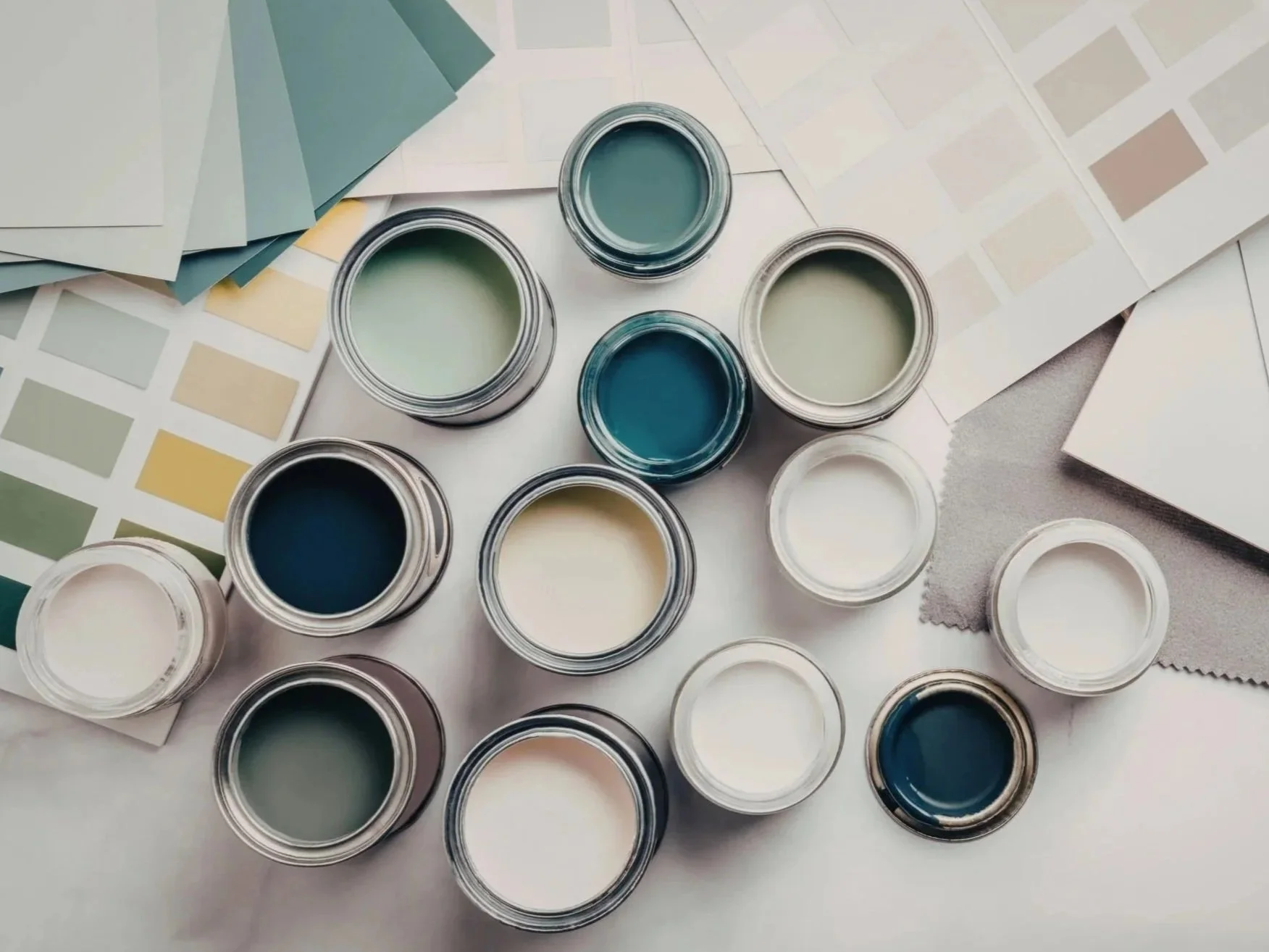
Undertones: The Silent Dealbreaker
Every paint color has an undertone. And this is where most DIY decisions go wrong.
What looks like a neutral beige might actually have:
Pink undertones (which can feel dated)
Green undertones (which can feel muddy)
Yellow undertones (which can feel overly warm)
If your furniture, flooring, or cabinets don’t align with those undertones, the entire room feels “off”—even if you can’t explain why.
Why It Looked So Good Online
Photos online are styled, filtered, and professionally lit.
That same color in your home is dealing with:
Your flooring tone
Your ceiling height
Your window direction
Your existing furniture
In other words—completely different conditions!
The Missing Piece: Layering
Paint isn’t meant to carry a room on its own.
Designers think in layers:
Wall color
Furniture tones
Textiles (rugs, pillows, curtains)
Natural materials
Accent colors
When these layers aren’t working together, it's easy to just blame the paint…
What Actually Makes a Difference?
Before choosing a color:
Test it in multiple areas of the room
Look at it in morning, afternoon, and evening light
Compare it against your flooring and furniture—not just a white wall
Choose colors as part of a full room plan—not in isolation
When It’s Time to Get Help
If you’ve painted a room (or two… or three) and it still doesn’t feel right, you’re not alone, and again, it’s not the simple colors you are drawn to…
Color is one of the most deceptively complex parts of design.
And getting it right isn’t about finding the “perfect” shade—it’s about creating a palette that works together. You CAN still include the colors you LOVE - we simply need to find the balance that makes your house feel at peace.
Book your complimentary 15-minute Dream Call with our Charlotte, NC team and let’s explore how to bring your space together.